Join the AI Workshop and learn to build real-world apps with AI. A hands-on, practical program to level up your skills.
With Tailwind CSS, it’s the same principle. But instead of writing a media query, we add a class to the HTML.
For example, suppose we want to build a responsive Grid layout.
We want it to have 1 column on small screens, 2 columns on the screen or laptop, and 3 columns on a big desktop screen.
Here’s what we do.
Let’s start with the Tailwind CSS starting template on CodePen.
Fork that.
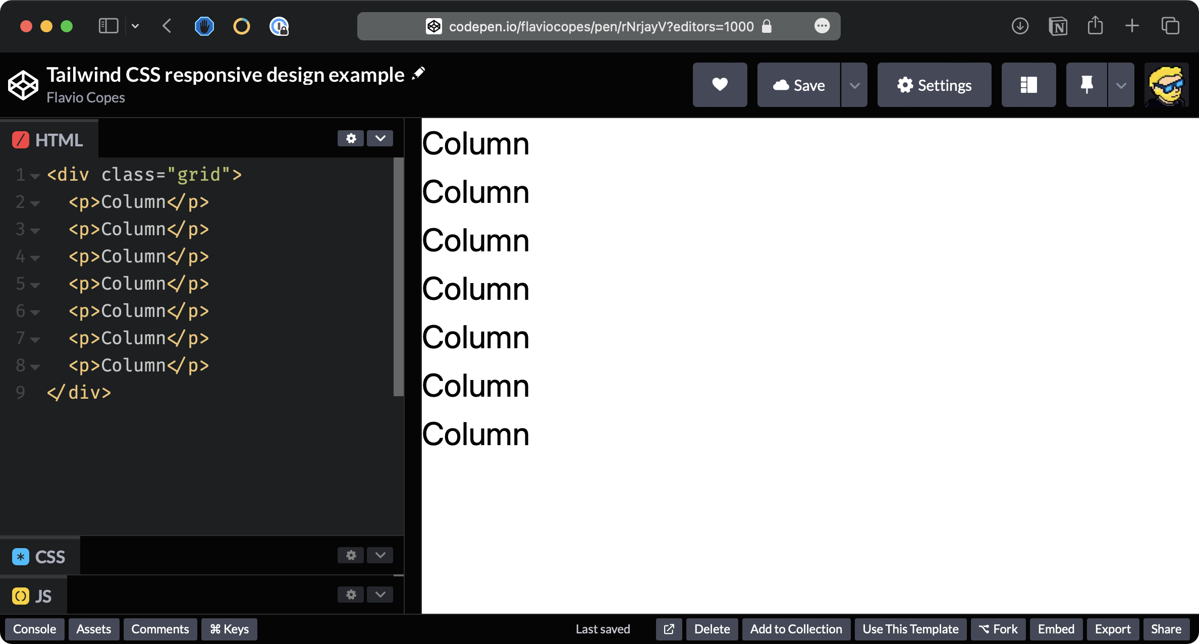
We define the HTML adding the grid class to enable the Grid layout:
<div class="grid">
  <p>Column</p>
  <p>Column</p>
  <p>Column</p>
  <p>Column</p>
  <p>Column</p>
  <p>Column</p>
  <p>Column</p>
</div>
This automatically uses a 1 column layout.
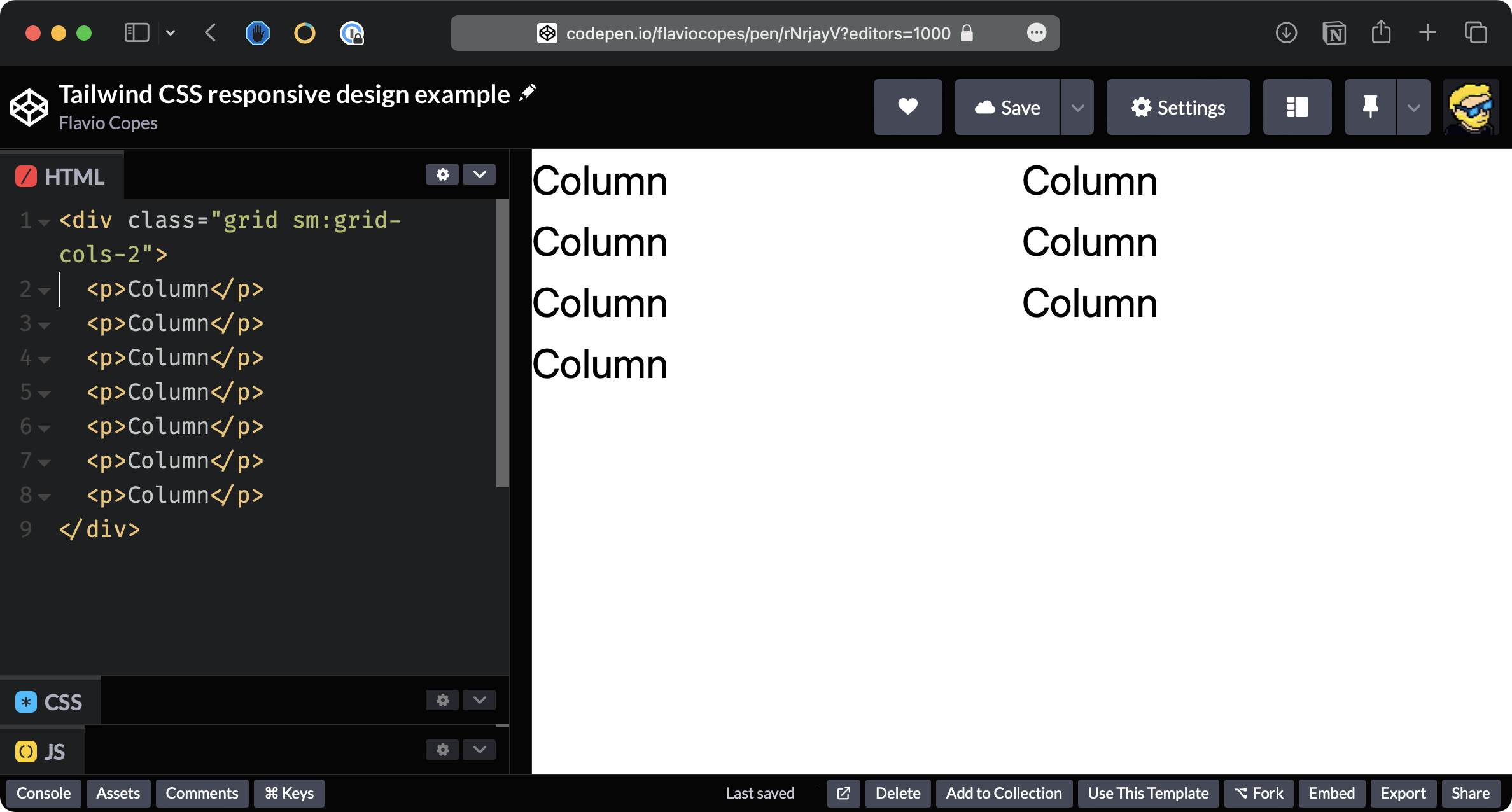
Now we use the sm: modifier and add sm:grid-cols-2 to apply two columns starting from screens of sm size:
<div class="grid sm:grid-cols-2">
  <p>Column</p>
  <p>Column</p>
  <p>Column</p>
  <p>Column</p>
  <p>Column</p>
  <p>Column</p>
  <p>Column</p>
</div>
You will see 2 columns if the window is large enough:
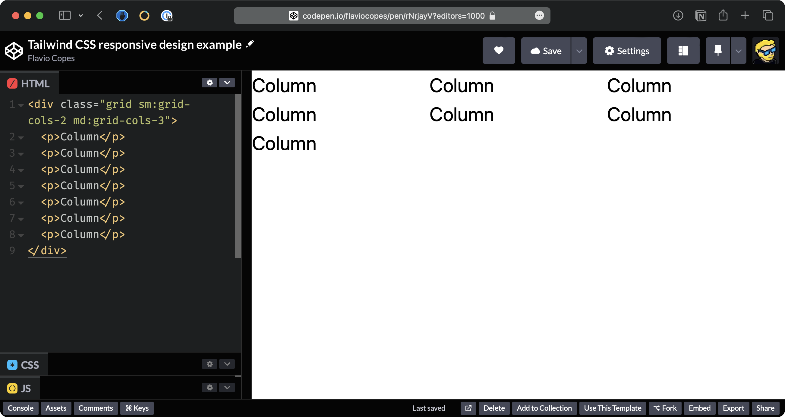
Now add md:grid-cols-3:
<div class="grid sm:grid-cols-2 md:grid-cols-3">
  <p>Column</p>
  <p>Column</p>
  <p>Column</p>
  <p>Column</p>
  <p>Column</p>
  <p>Column</p>
  <p>Column</p>
</div>
You will see 3 columns when the window is large enough:
We have the following prefixes, called breakpoints:
| Prefix | Minimum width |
|---|---|
| sm | 640px |
| md | 768px |
| lg | 1024px |
| xl | 1280px |
| 2xl | 1536px |
Those prefixes can be applied to any Tailwind class.
It’s important to realize that any Tailwind class is applied to all sizes by default.
Using a breakpoint prefix will only apply that class to screen sizes bigger than the one specified in the table.
So bg-black applies that background all the time, sm:bg-black only applies the black background if the screen is bigger than 640px.