Join the AI Workshop and learn to build real-world apps with AI. A hands-on, practical program to level up your skills.
It’s common in iOS apps to use a Tab View. The one with a few choices at the bottom, and you can completely switch what’s in the screen by tapping the icon / label.
SwiftUI conveniently provides us a view called TabView, which makes it easy to implement such a UI pattern.
Here’s the simplest possible example of a TabView:
import SwiftUI

struct ContentView: View {

    var body: some View {
        TabView {
            Text("First")
                .tabItem {
                    Label("First", systemImage: "tray")
                }

            Text("Second")
                .tabItem {
                    Label("Second", systemImage: "calendar")
                }
        }
    }
}
And here’s the result:
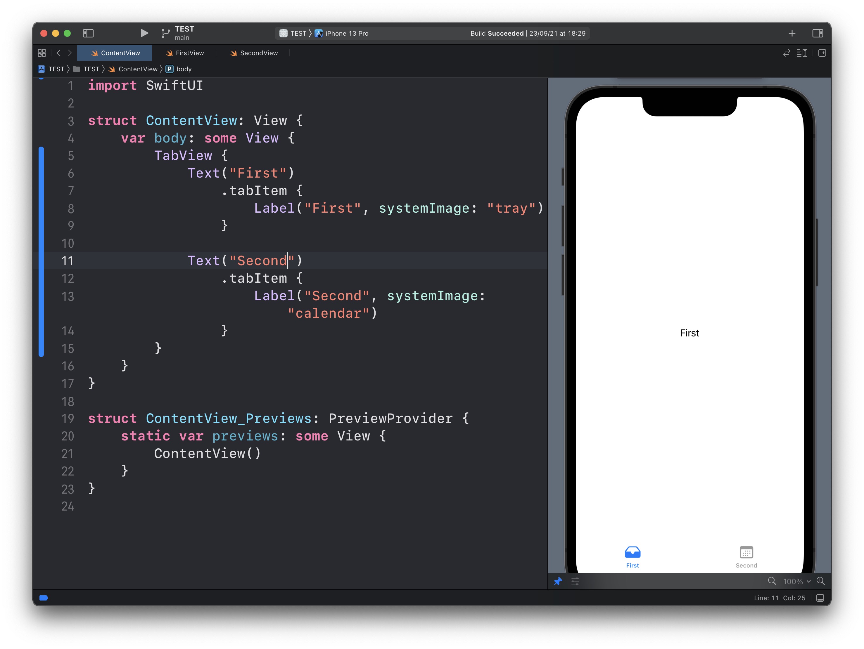
See? We have a TabView view, and inside it, we have 2 views.
Both are Text views to make it simple.
Their tabItem modifier will add them to the TabView with a label provided as a Label view.
Of course you will want to use a custom view instead of Text in most cases.
Lessons in this unit:
| 0: | Introduction |
| 1: | NavigationView |
| 2: | ▶︎ TabView |
| 3: | SF Symbols |
| 4: | Forms |
| 5: | TextField in Forms |
| 6: | Toggle in Forms |
| 7: | Slider in Forms |
| 8: | Stepper in Forms |
| 9: | Picker in Forms |
| 10: | DatePicker in Forms |