Join the AI Workshop and learn to build real-world apps with AI. A hands-on, practical program to level up your skills.
The DatePicker form control in SwiftUI lets us create a date picker.
How does it work?
First we create a property of type Date:
@State private var dateChosen = Date()We use @State so that we can modify this value from our
DatePickerview
Then we link that property to the DatePicker view:
DatePicker(selection: $dateChosen, in: ...Date()) {
Text("Pick a date and time")
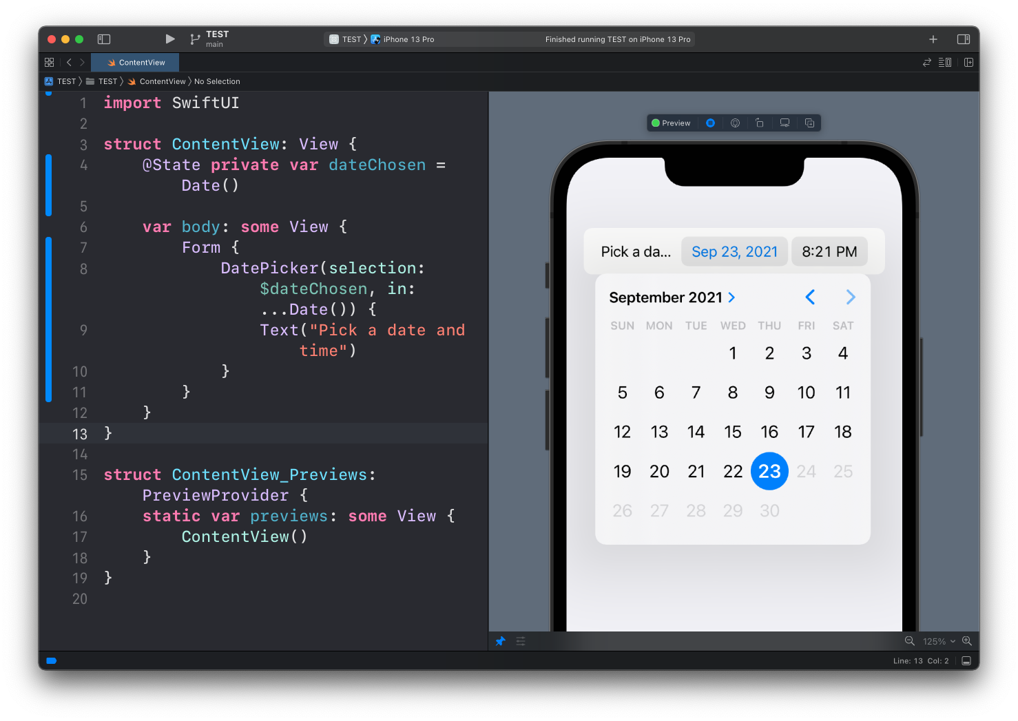
}Here’s how it looks:

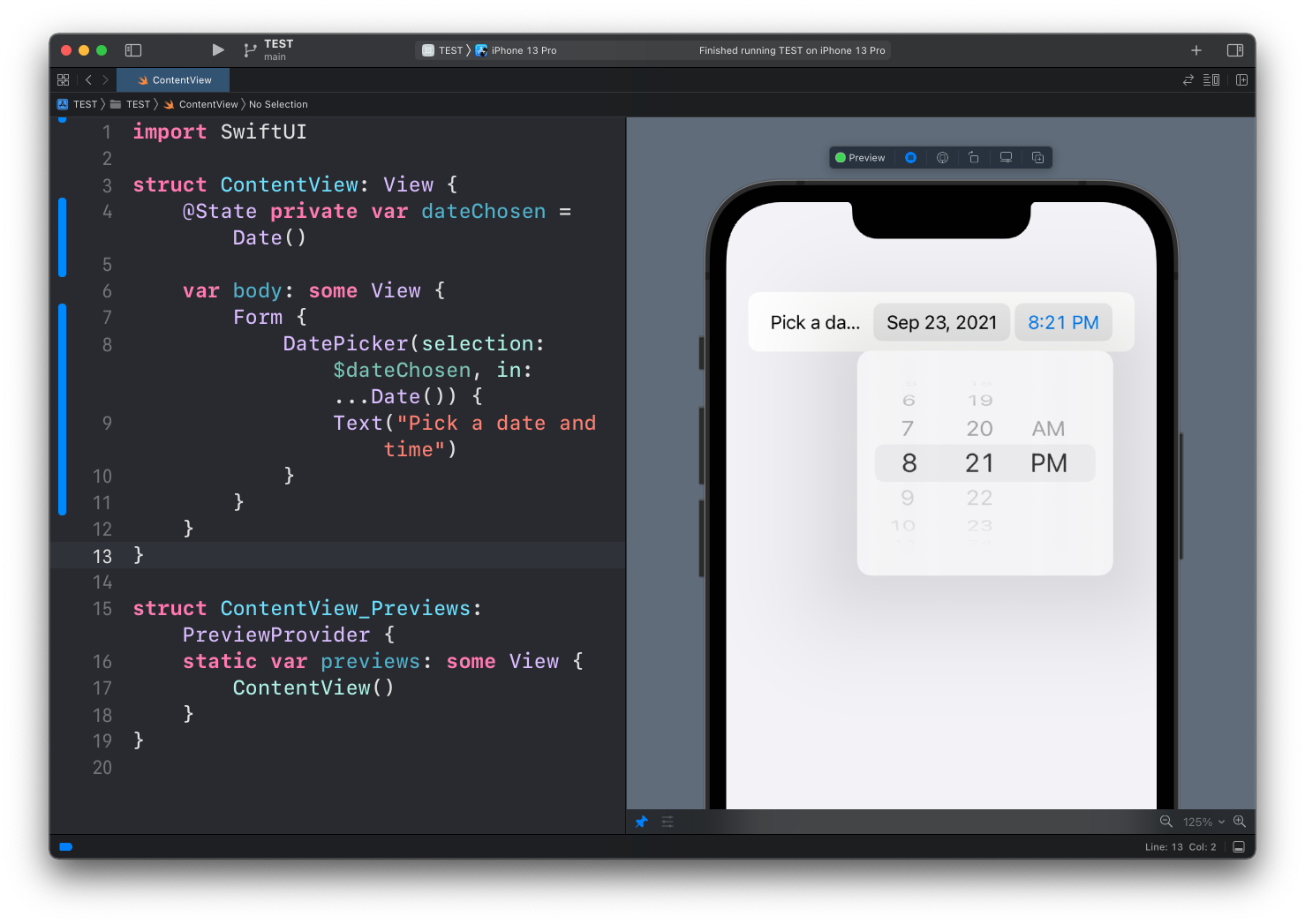
Tapping on each different part (date or time) will show a dedicated picker UI element:
Here’s the full code of this example:
struct ContentView: View {
@State private var dateChosen = Date()
var body: some View {
Form {
DatePicker(selection: $dateChosen, in: ...Date()) {
Text("Pick a date and time")
}
}
}
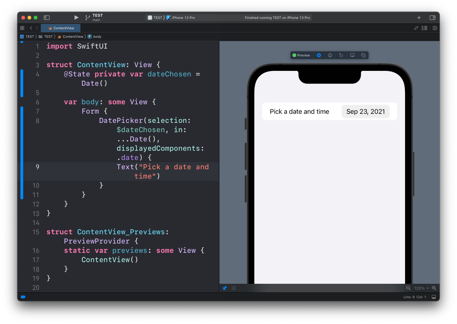
}You can choose to only show one particular element of the date with the displayedComponents property, like just the date:
DatePicker(selection: $dateChosen, in: ...Date(), displayedComponents: .date) {
    Text("Pick a date and time")
}
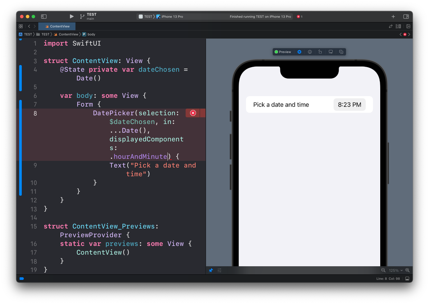
or just the time:
DatePicker(selection: $dateChosen, in: ...Date(), displayedComponents: .hourAndMinute) {
    Text("Pick a date and time")
}
Lessons in this unit:
| 0: | Introduction |
| 1: | NavigationView |
| 2: | TabView |
| 3: | SF Symbols |
| 4: | Forms |
| 5: | TextField in Forms |
| 6: | Toggle in Forms |
| 7: | Slider in Forms |
| 8: | Stepper in Forms |
| 9: | Picker in Forms |
| 10: | ▶︎ DatePicker in Forms |