Join the AI Workshop and learn to build real-world apps with AI. A hands-on, practical program to level up your skills.
I had the need to make a sidebar look in one particular way on a big screen in React, and in another way on a smaller screen, so I wanted to have some way to detect responsive layouts changes in JSX.
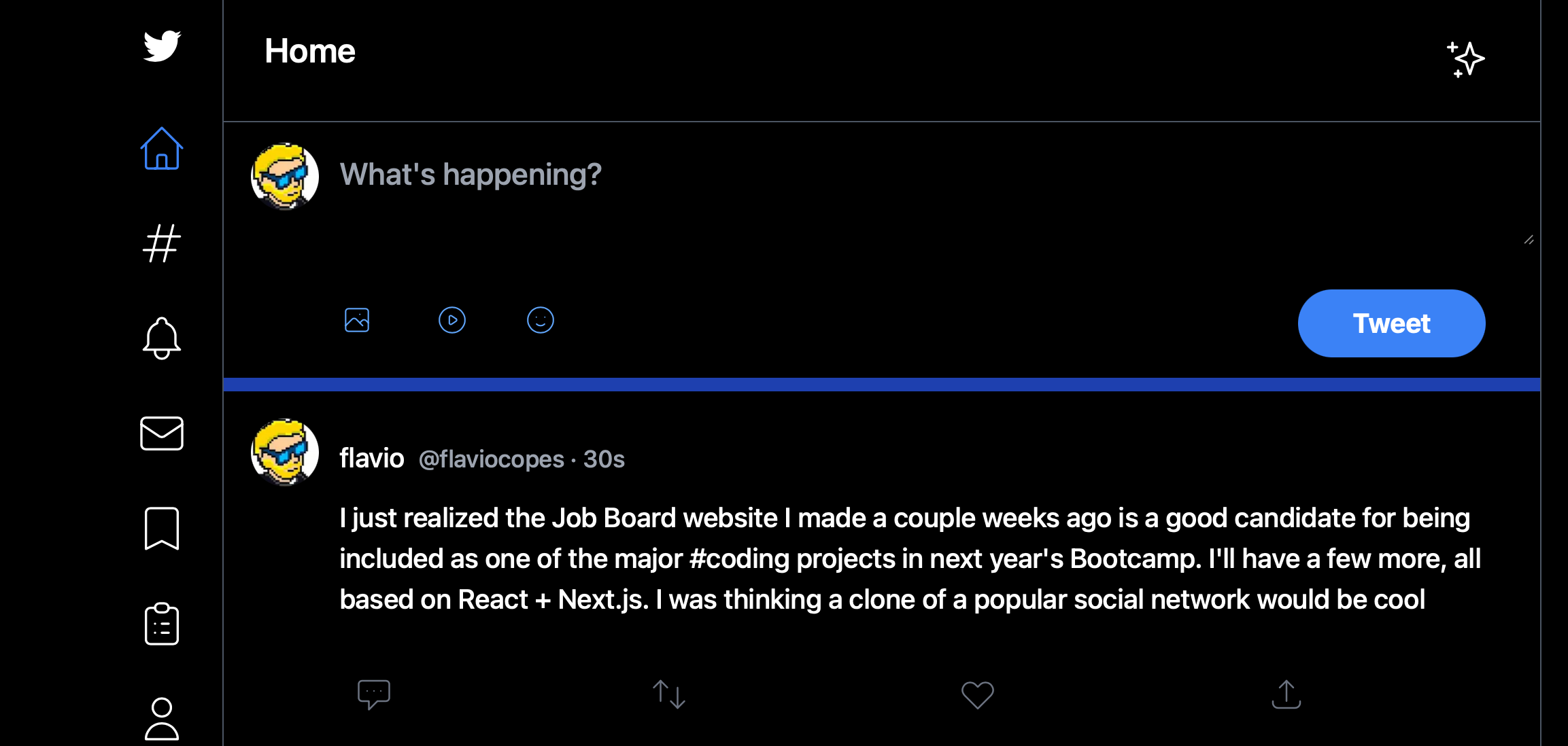
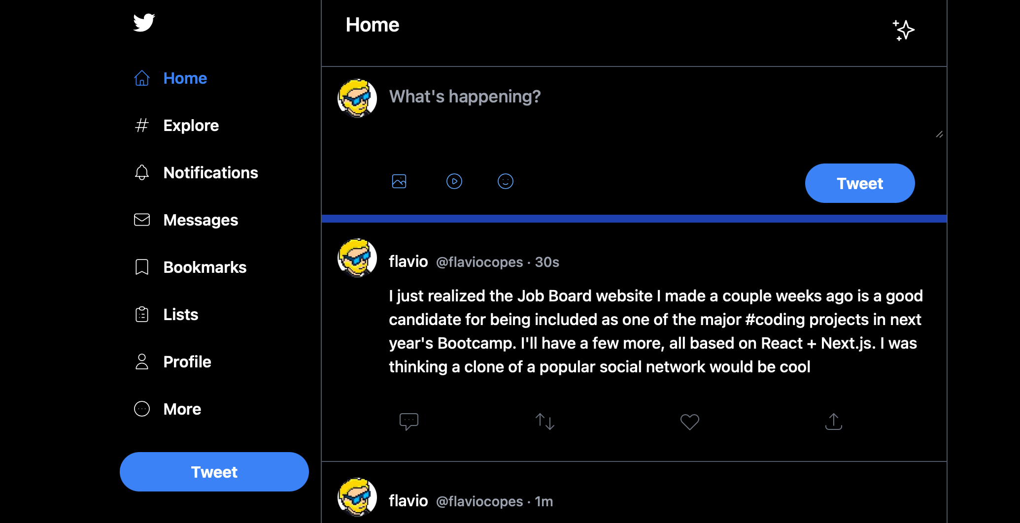
Like this:
You can use the react-responsive package to do that.
npm install react-responsiveThen you can import the useMediaQuery hook:
import { useMediaQuery } from 'react-responsive'And in your components you can use it like this:
  const isBigScreen = useMediaQuery({ query: '(min-device-width: 1224px)' })
  const isSmallScreen = useMediaQuery({ query: '(max-width: 1224px)' })
This is a simple breakpoint example I found on the package’s home page, and they worked fine for my needs.
I used it in a layout component in this way:
import { useMediaQuery } from 'react-responsive'

export default function Layout({ children }) {
  const isBigScreen = useMediaQuery({ query: '(min-device-width: 1224px)' })
  const isSmallScreen = useMediaQuery({ query: '(max-width: 1224px)' })

  return (
    <div>
        {isSmallScreen ? (
          <LeftSidebar small={true} />
        ) : (
          <LeftSidebar />
        )}
    </div>
  )
}
I used it to pass a small prop to a LeftSidebar component, so it knew how to render itself.
You can also do things differently and create components to wrap JSX, which I find clearer:
import { useMediaQuery } from 'react-responsive'

const BigScreen = ({ children }) => {
  return useMediaQuery({ minWidth: 992 }) ? children : null
}

const SmallScreen = ({ children }) => {
  return useMediaQuery({ maxWidth: 991 }) ? children : null
}

export default function Layout({ children }) {
  return (
      <div>
        <SmallScreen>
          <LeftSidebar small={true} />
        </SmallScreen>
        <BigScreen>
          <LeftSidebar />
        </BigScreen>
    </div>
  )
}