Join the AI Workshop and learn to build real-world apps with AI. A hands-on, practical program to level up your skills.
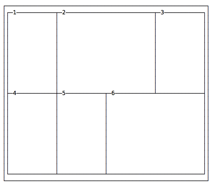
Every cell item has the option to occupy more than just one box in the row, and expand horizontally or vertically to get more space, while respecting the grid proportions set in the container.
Those are the properties we’ll use for that:
grid-column-startgrid-column-endgrid-row-startgrid-row-end
Example:
.container {
  display: grid;
  grid-template-columns: 200px 200px 200px 200px;
  grid-template-rows: 300px 300px;
}
.item1 {
  grid-column-start: 2;
  grid-column-end: 4;
}
.item6 {
  grid-column-start: 3;
  grid-column-end: 5;
}
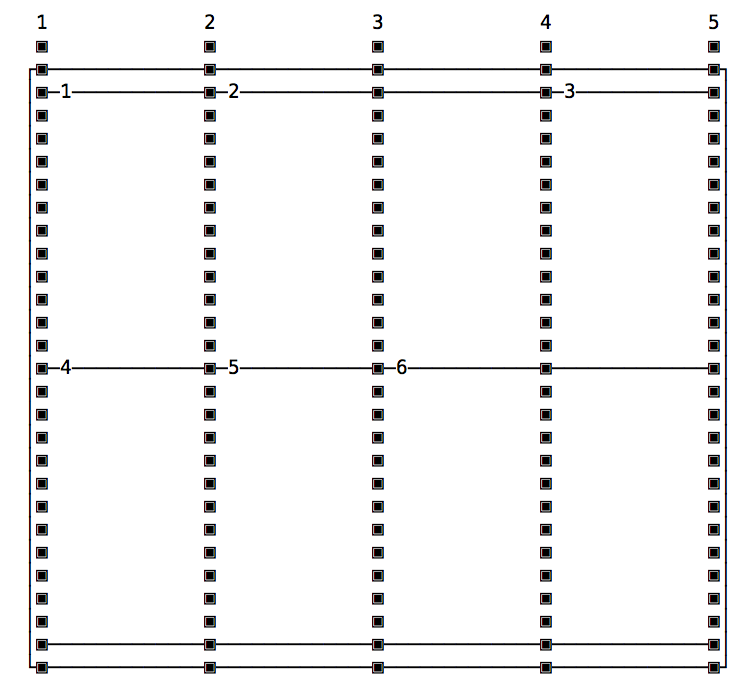
The numbers correspond to the vertical line that separates each column, starting from 1:

The same principle applies to grid-row-start and grid-row-end, except this time instead of taking more columns, a cell takes more rows.
Shorthands: grid-column, grid-row and grid-area
Those properties have a shorthand syntax provided by:
grid-columngrid-row
The usage is simple, here’s how to replicate the above layout:
.container {
  display: grid;
  grid-template-columns: 200px 200px 200px 200px;
  grid-template-rows: 300px 300px;
}
.item1 {
  grid-column: 2 / 4;
}
.item6 {
  grid-column: 3 / 5;
}
The grid-area property can be used as a shorthand for the grid-column and grid-row shorthands, when you need to apply both to a single element. Instead of having:
.item1 {
  grid-row: 1 / 4;
  grid-column: 3 / 5;
}
You can use
.item1 {
  grid-area: 1 / 3 / 4 / 5;
}
(grid-row-start / grid-column-start / grid-row-end / grid-column-end)
Using span
Another approach is to set the starting column/row, and set how many it should occupy using span:
.container {
  display: grid;
  grid-template-columns: 200px 200px 200px 200px;
  grid-template-rows: 300px 300px;
}
.item1 {
  grid-column: 2 / span 2;
}
.item6 {
  grid-column: 3 / span 2;
}
span works also with the non-shorthand syntax:
.item1 {
  grid-column-start: 2;
  grid-column-end: span 2;
}
and you can also use it on the start property. In this case, the end position will be used as a reference, and span will count “back”:
.item1 {
  grid-column-start: span 2;
  grid-column-end: 3;
}