Join the AI Workshop and learn to build real-world apps with AI. A hands-on, practical program to level up your skills.
I want to do a little demo of CSS Grid.
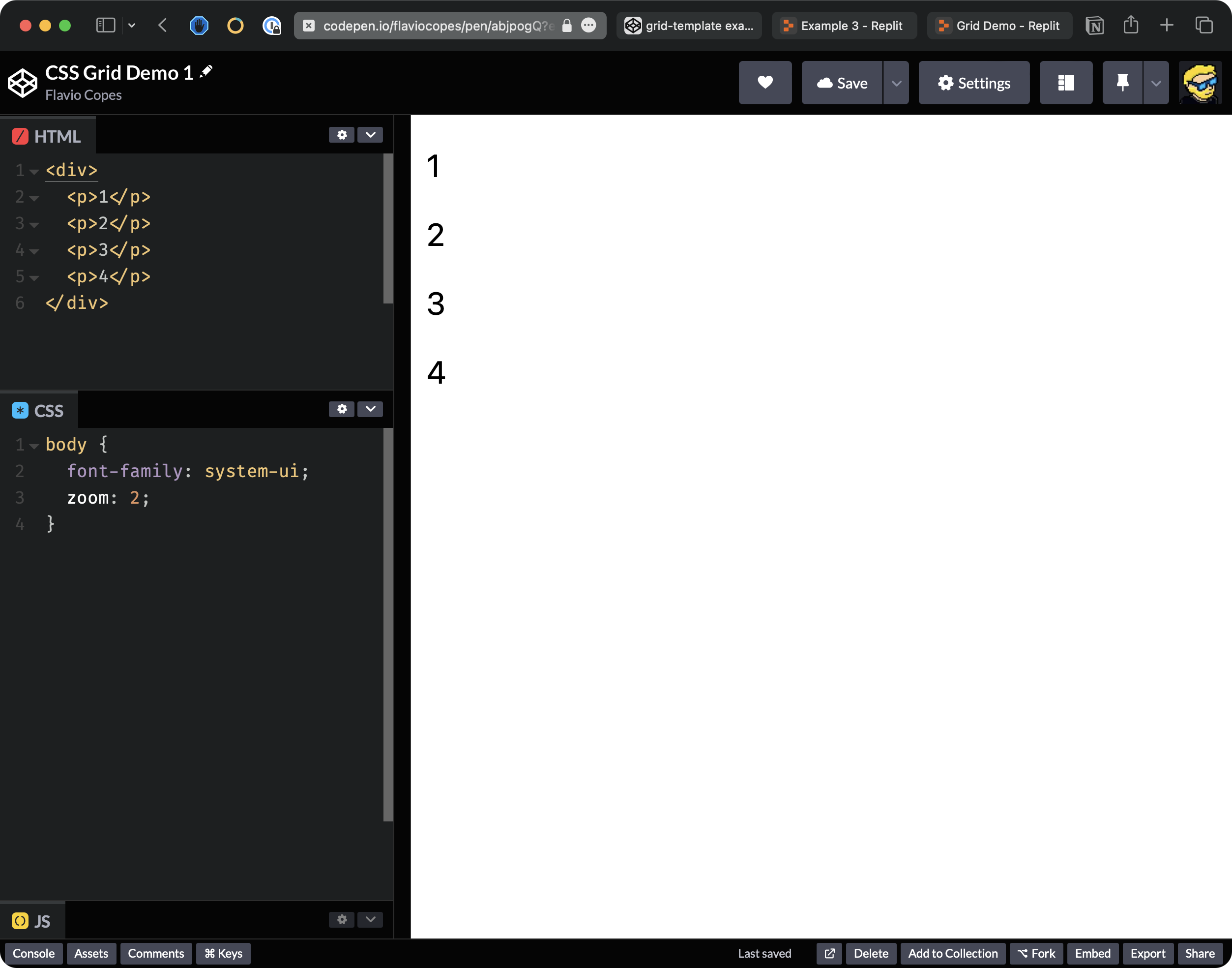
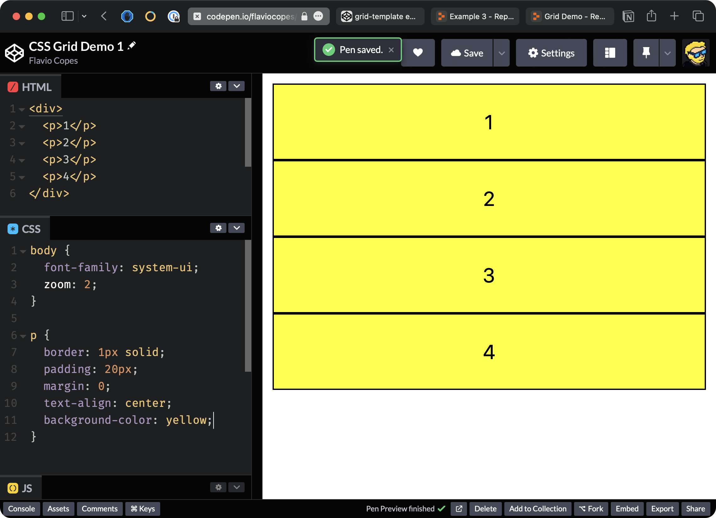
Starting from this codepen where we have a body with a div and 4 paragraphs that by default are styled like this:
Note: 💁♂️
zoom: 2is just a setting to make the result bigger, you can freely remove that
Because p tags are block elements, we have one for each line.
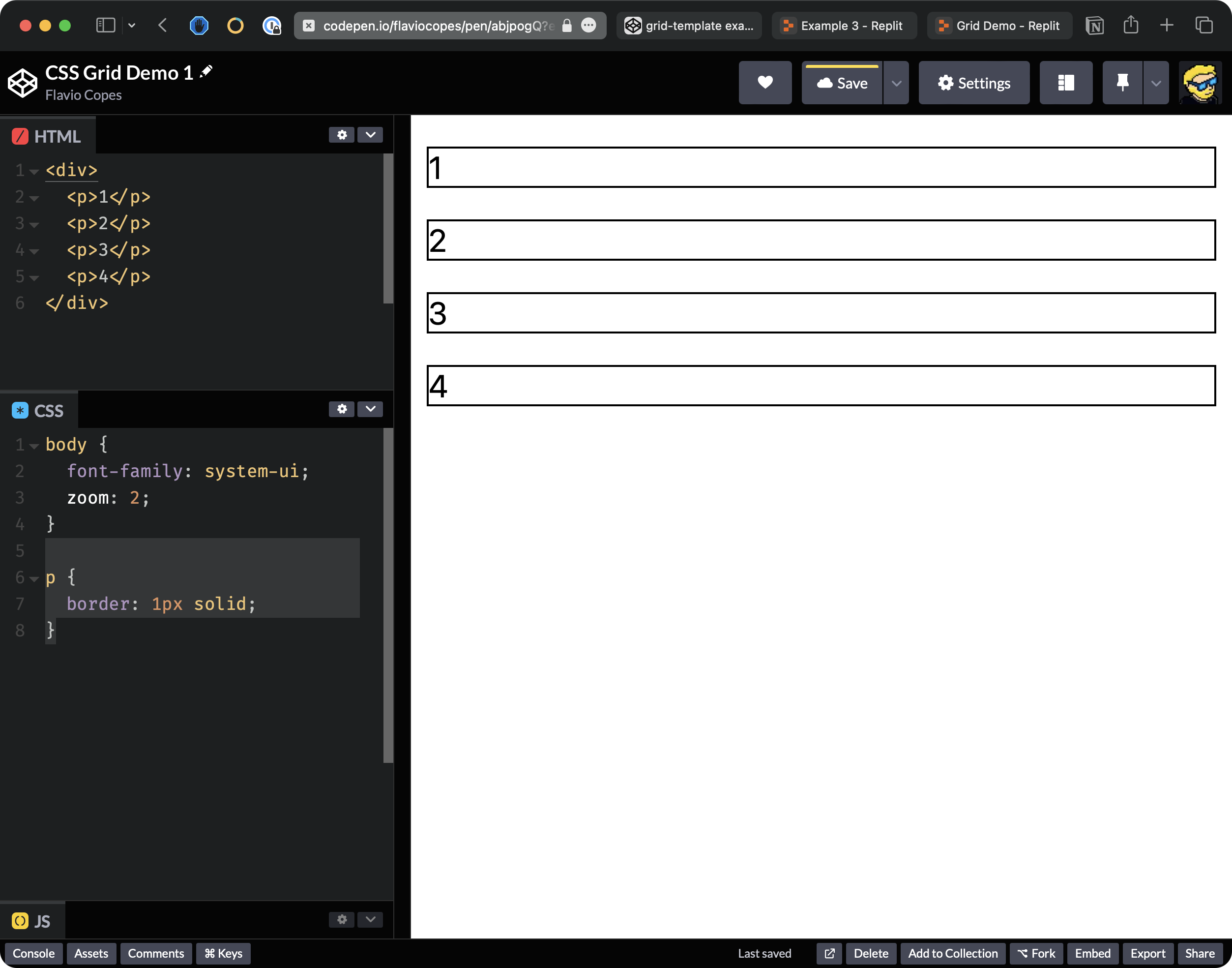
Let’s add a little border to the paragraphs.
p {
  border: 1px solid;
}
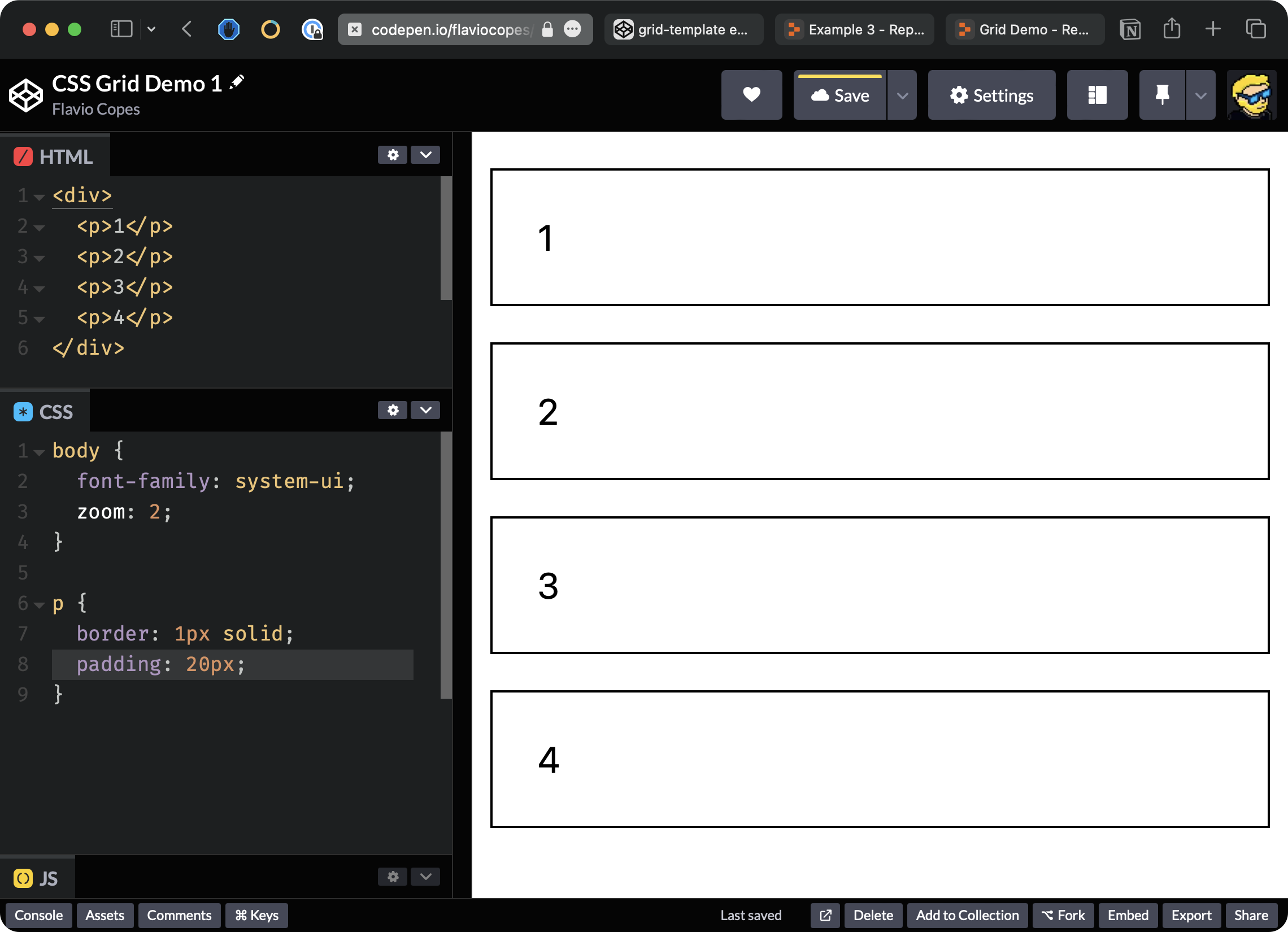
I’m going to add some padding, like 20 pixels, so we have some more spacing inside the p tag
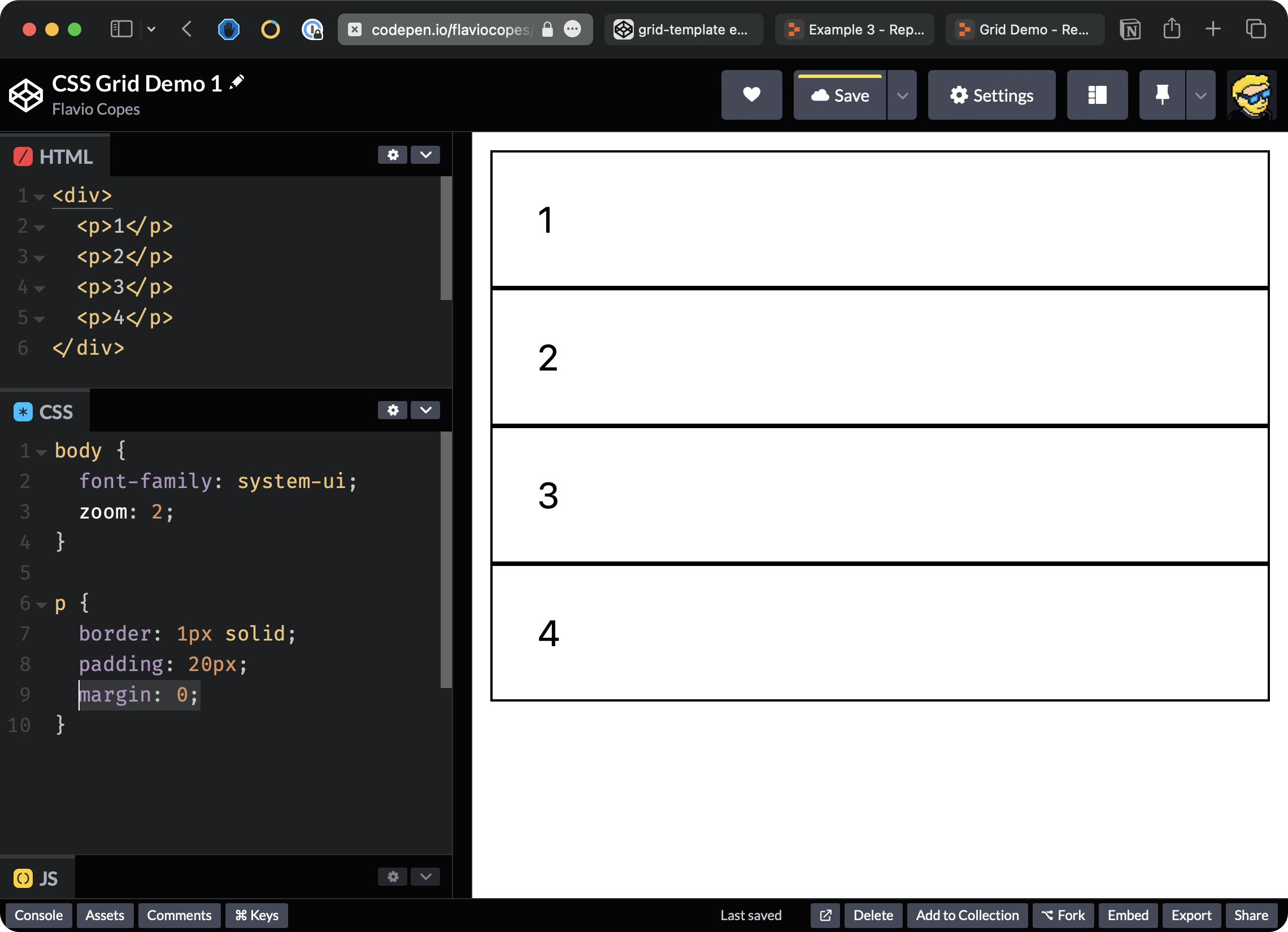
I’m going to remove all the margin, which is added by the browser, so each p element is close to the other.
I’m also going to say text-align: center to center the text inside the p tag. Let me also pick a nicer color, for example, this one and I’m going to say background-color: yellow.
Let’s now set the p elements to be laid out using CSS Grid.
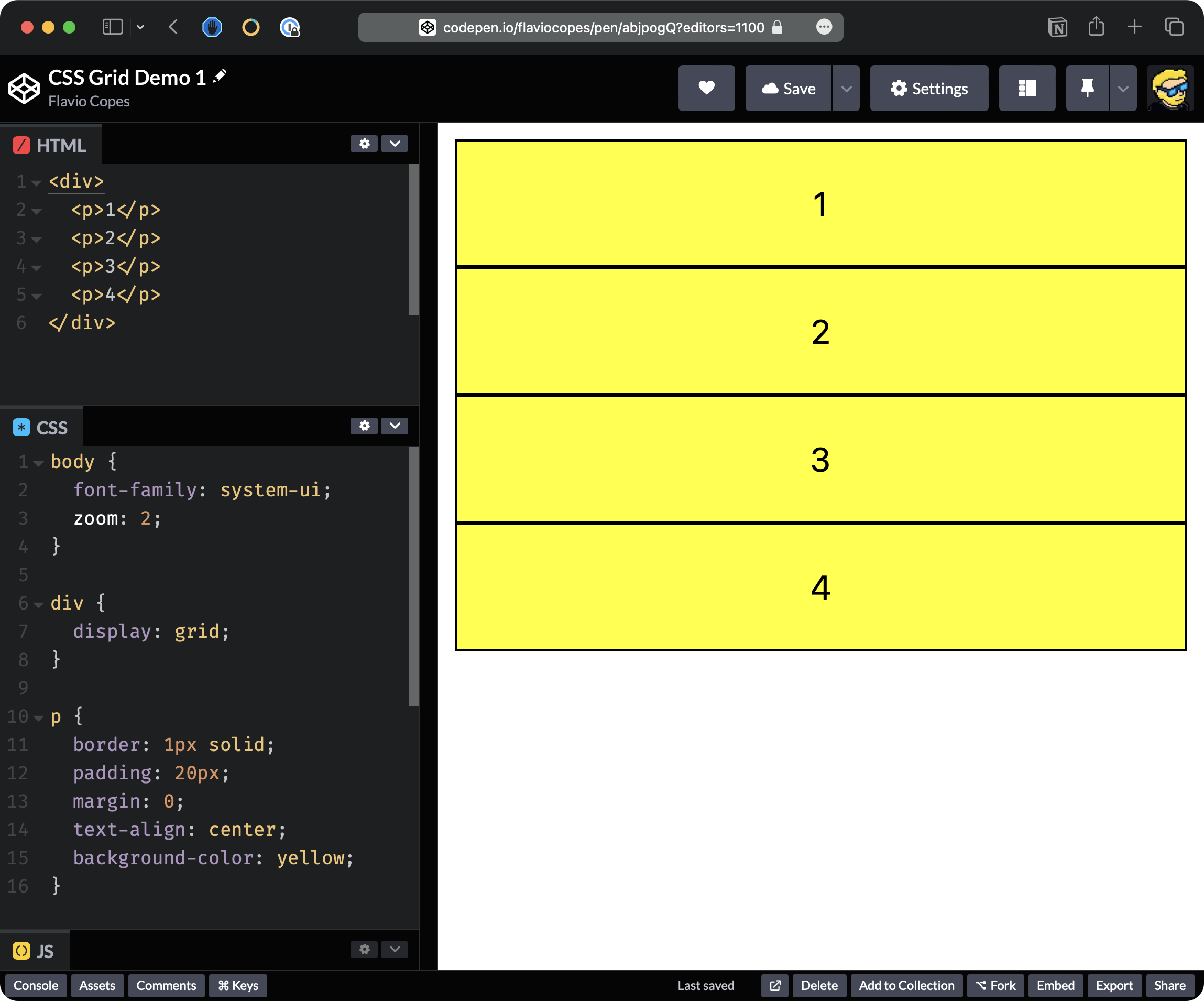
We add display: grid to the div element that contains all the p tags.
We enabled the grid layout, but nothing changed because CSS Grid by default aligns the elements vertically in a single column.
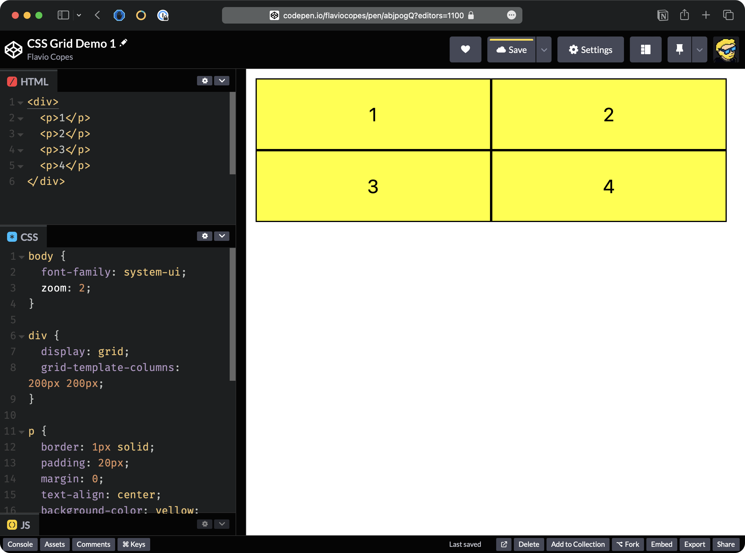
To change that we need to set two columns. So we say grid-template-columns: 200px 200px
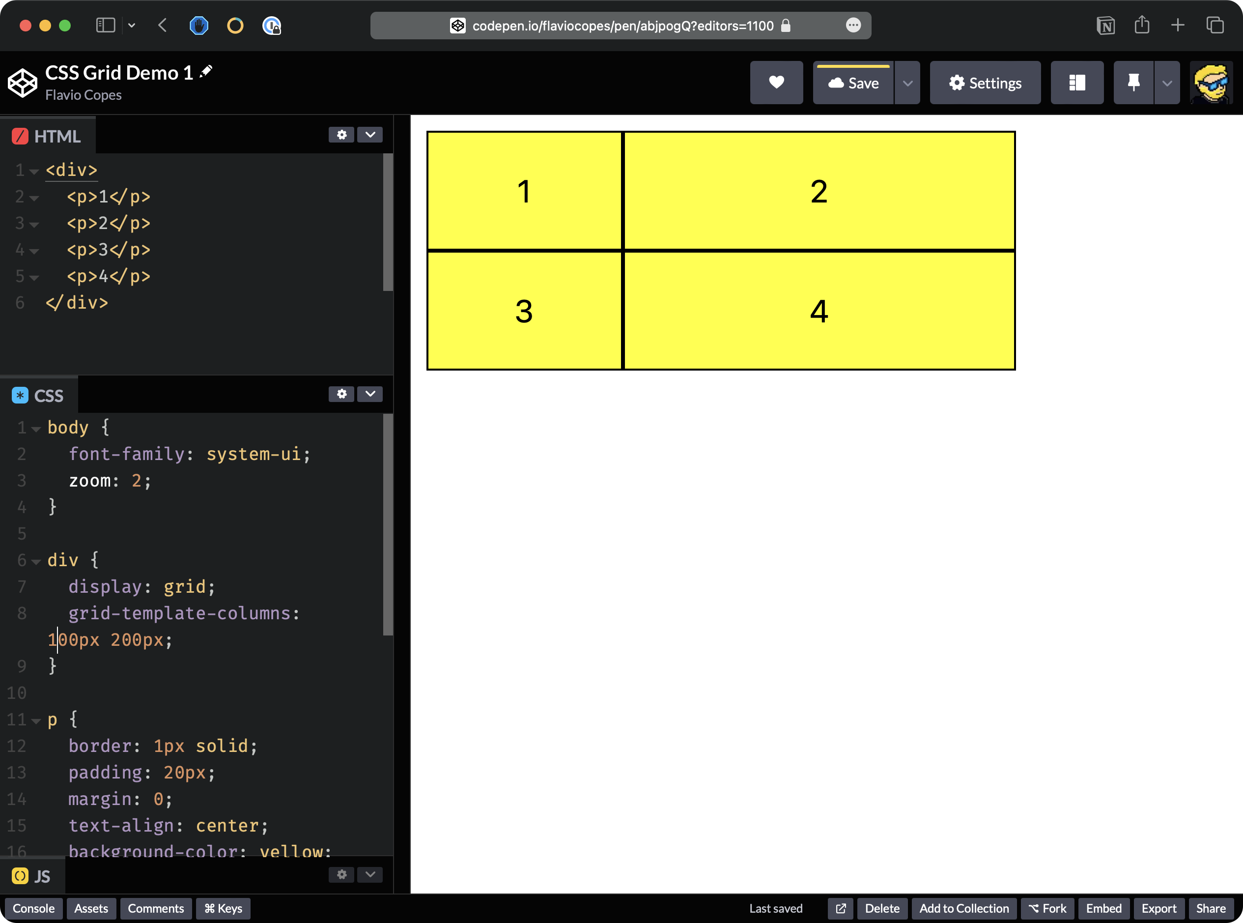
So we can also set different sizes, for example, let’s set the first column as 100px, and the second as 200px:
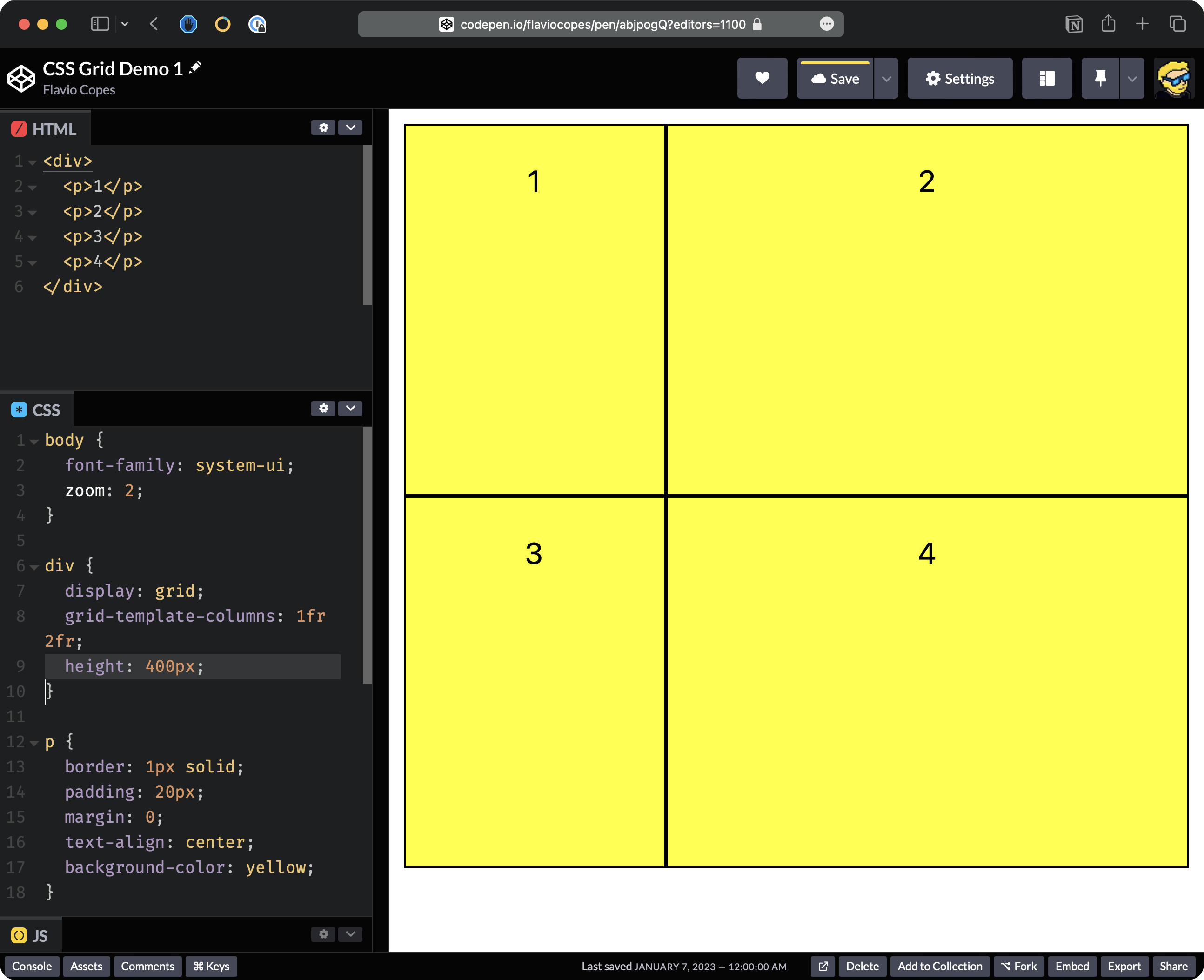
Instead of using pixels, we could also use fractions. Fractions basically divide all the space available into equal fractions. So for example, we can say that I want this layout to have 1 fraction for the first column and 2 fractions for the second. So we expect this to divide all the space available to the div into 3 equal parts, and use it accordingly to our rules, using grid-template-columns: 1fr 2fr;

Enough with the columns.
For rows, it’s different because height is calculated a little bit differently. It doesn’t expand to the full height available. We need to set an explicit height, like this:
div {
  display: grid;
  grid-template-columns: 1fr 2fr;
  height: 400px;
}
We can also set the gap between each item in the grid, so we can say gap: 20px and this will make a gap between each element in the grid.
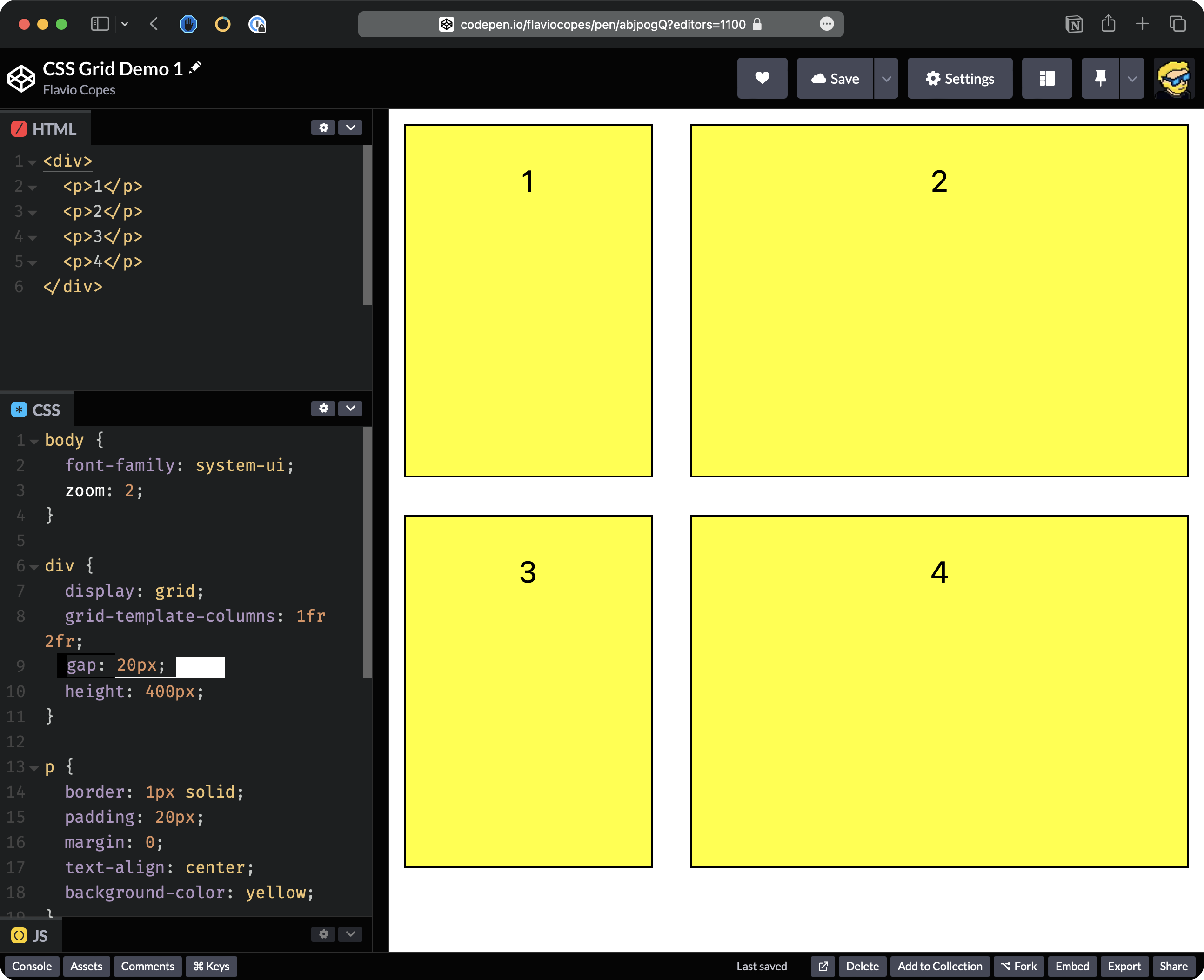
Here’s the final demo Codepen.
Note: in the video I use grid-gap to add the gap - it works in the same way as gap, but it’s an old name for that property (please forgive me)