Join the AI Workshop and learn to build real-world apps with AI. A hands-on, practical program to level up your skills.
Here is a simple example of using CSS Grid to create a site layout that provides a header on top, a main part with sidebar on the left and content on the right, and a footer afterwards.
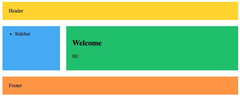
Here’s the markup:
<div class="wrapper">
  <header>Header</header>
  <article>
    <h1>Welcome</h1>
    <p>Hi!</p>
  </article>
  <aside><ul><li>Sidebar</li></ul></aside>
  <footer>Footer</footer>
</div>
and here’s the CSS:
header {
  grid-area: header;
  background-color: #fed330;
  padding: 20px;
}
article {
  grid-area: content;
  background-color: #20bf6b;
  padding: 20px;
}
aside {
  grid-area: sidebar;
  background-color: #45aaf2;
}
footer {
  padding: 20px;
  grid-area: footer;
  background-color: #fd9644;
}
.wrapper {
  display: grid;
  grid-gap: 20px;
  grid-template-columns: 1fr 3fr;
  grid-template-areas:
    "header  header"
    "sidebar content"
    "footer  footer";
}
I added some colors to make it prettier, but basically it assigns a grid-area name to each tag, which is used in the grid-template-areas property in .wrapper.
When the layout is smaller we can put the sidebar below the content using a media query:
@media (max-width: 500px) {
  .wrapper {
    grid-template-columns: 1fr;
    grid-template-areas:
      "header"
      "content"
      "sidebar"
      "footer";
  }
}