Join the AI Workshop and learn to build real-world apps with AI. A hands-on, practical program to level up your skills.
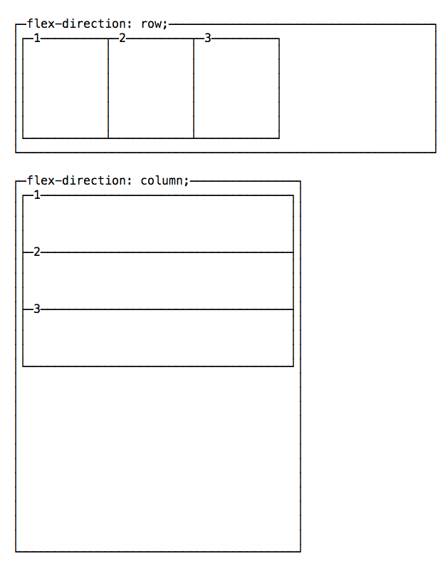
By default items start from the left if flex-direction is row, and from the top if flex-direction is column.
You can change this behavior using justify-content to change the horizontal alignment, and align-items to change the vertical alignment.
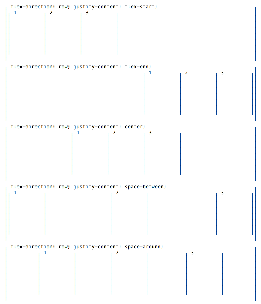
Change the horizontal alignment
justify-content has 5 possible values:
flex-start: align to the left side of the container.flex-end: align to the right side of the container.center: align at the center of the container.space-between: display with equal spacing between them.space-around: display with equal spacing around them.
Change the vertical alignment
align-items has 5 possible values:
flex-start: align to the top of the container.flex-end: align to the bottom of the container.center: align at the vertical center of the container.baseline: display at the baseline of the container.stretch: items are stretched to fit the container.
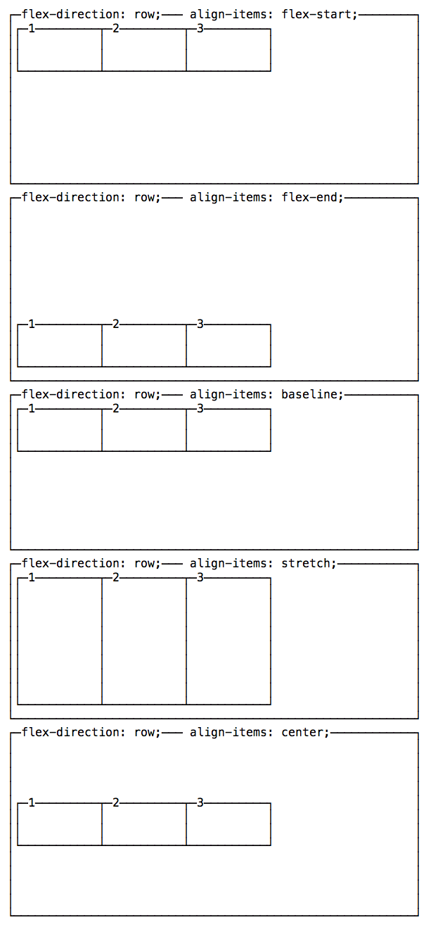
A note on baseline
baseline looks similar to flex-start in this example, due to my boxes being too simple. Check out this Codepen to have a more useful example, which I forked from a Pen originally created by Martin Michálek. As you can see there, items’ dimensions are aligned.